Other posts in this series: Part 1, Part 2
I think my fiddle leaf fig posts have been my most popular blog entries so far. I’ve had many reader requests for another update in the comments sections of those posts, through my “contact me” page, and even on my instagram account! I’m sorry that It has taken me so long to finally get around to this, but as promised, here’s my latest update!
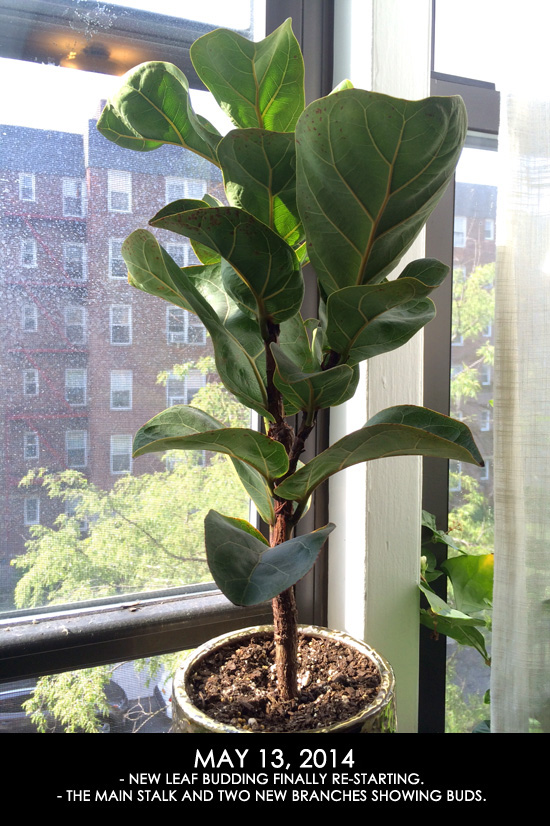
My last post left off on May 13th. I had pruned the top of the tree a month prior, and new branch buds were starting to grow in as a result.
Unfortunately the rest of the summer had not gone as smoothly as the year before. And I believe this is due to choosing a pot that did not allow for proper drainage or drying of the soil. Sigh, that’s what I get for choosing form over function. The first sign that this was a problem was when rust colored spots began to appear on some of the older leaves.
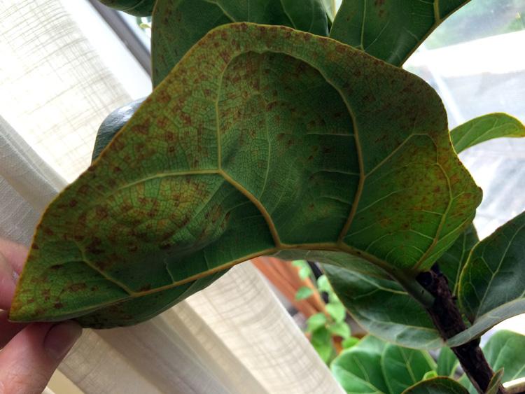
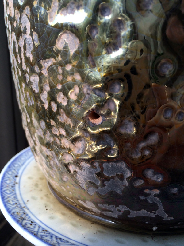
My poor baby! This is a very clear sign of root stress. It’s usually either caused by too much water or too little water. In my case I knew for sure it was too much water. The previous year, it was in a smaller pot that was extremely porous. The soil would dry out completely in a matter of two or three days. During that time, I never saw any signs of distress from my little fiddle. This summer, however, the new pot seemed to take over a week to totally dry out so I’m pretty sure this was the problem. The soil even started to grow little yellow mushrooms which is a clear sign of too much moisture. My temporary solution to this problem was to drill additional holes into the pot using masonry drill bits. I increase the size and number of the bottom holes for drainage, and added tiny vents to the sides of the pot as well.
After doing this, all of the new leaf growth was significantly healthier and I have not had any new spotting since. Check out how nicely the new branches were developing by July.
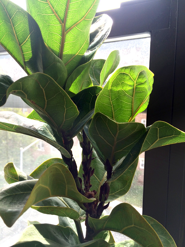
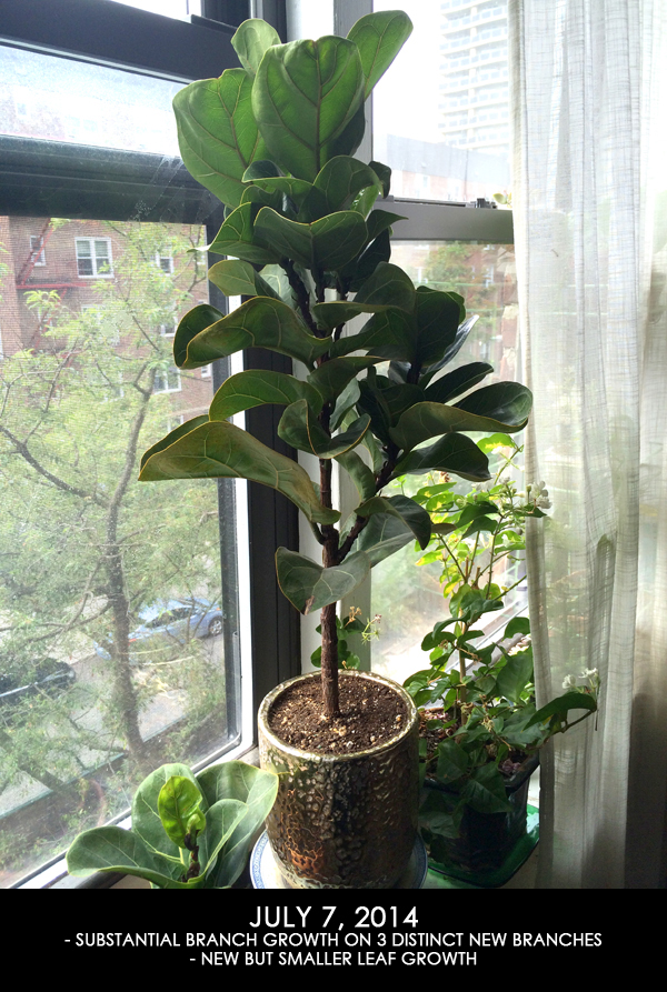
So much better! But the only other problem is that the new leaves came in small and stayed small. The previous year, all the leaves would grow in HUGE. I’m wondering if its a combination of the root stress along with sort of a bonsai effect from the pruning. And perhaps the stupid pot too. I was holding out hope that I could make this pot work, but I still feel that it may not be ideal for this particular fussy tree. Come Spring, I may re-pot into a terracotta pot that will allow for more water evaporation. I want to wait until the next growing season so that I do not add more stress to the roots while its in winter dormancy. I also do not plan to do any more pruning next year. I’m really happy with the number of branches that it has and I’d like to give it a year to fully recover.
After the July photo above, the branches grew a bit longer and then entered into winter dormancy around October or so. Once it became dormant, I reduced how often I water the plant. Here’s what it looks like today.
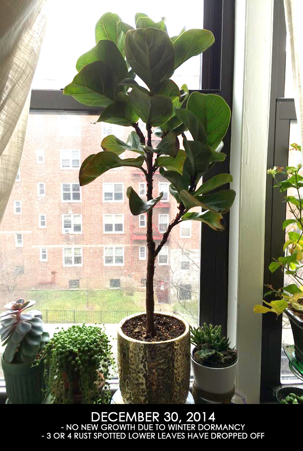
You can clearly see all of the new branches which gives it a much prettier tree-like shape. The fiddle also dropped some of the lower leaves, the ones that were the most badly damaged by the root stress incident. You can still see some damage on a couple of the other lower leaves, but I feel confident that this little plant will bounce back next year since all of the new growth still looks so healthy. I’ll definitely update next summer once it starts growing again.